Class Notes:
Project:
Color & Hierarchy Project
Create 3 different layouts that experiment with Hierarchy and Color Theory. Size: 11in x 17in (Tabloid), 3 artboards
Use at least THREE of the following Hierarchy sizes and at least ONE color relationship per layout.
Hierarchy- Type Sizes
Display – 36-72 points (can be larger)
Headline- 18-36 points
Sub-headline- 14-18 points
Body Copy/Text- 8-12 points (10 points is average) Fine Print/Classified- 6-8 points
Color Theory Relationships:
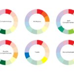
Complimentary, Analogous, Monochromatic, Triad
You can add any images you like. Your poster can be about any subject you choose.
Save the project as Color_and_Hierarchy.ai for your records. Save the project as Color_and_Hierarchy.pdf and upload to google classroom.
Notes:
Color and Hierarchy are two basic things that must always be considered when creating a layout.
Hierarchy
-the clear structure of the the type on a page
-determines what type gets read first
-is a combination of size, color and placement
Hierarchy- Traditional Type Sizes
Display – 36-72 points (can be larger)
Headline- 18-36 points
Sub-headline- 14-18 points
Body Copy/Text- 8-12 points (10 points is average)
Fine Print/Classified- 6-8 points
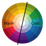
Color is an important element in any work of art or design. Understanding the basics of color theory and color relationships can help you use the correct colors to increase readability or to create a special effect.
Color Theory- Basic Relationships
Complimentary
Analogous
Monochromatic
Triad
Illustrator Paragraph Shortcuts
CMD+SHIFT and Arrows (next to M) to increase size of type
ALT + UP/DOWN change leading
ALT + RIGHT/LEFT change tracking
ALT + RIGHT/LEFT change kerning (when in between two letters)
ALT + SHIFT on word change baseline
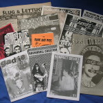
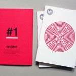
Zine Info and Templates
