Project- Project 8 Color and Hierarchy
Color and Hierarchy are two basic things that must always be considered when creating a layout.
Hierarchy
-the clear structure of the the type on a page
-determines what type gets read first
-is a combination of size, color and placement
Hierarchy- Traditional Type Sizes
Display – 36-72 points (can be larger)
Headline- 18-36 points
Sub-headline- 14-18 points
Body Copy/Text- 8-12 points (10 points is average)
Fine Print/Classified- 6-8 points
Color is an important element in any work of art or design. Understanding the basics of color theory and color relationships can help you use the correct colors to increase readability or to create a special effect.
Color Theory- Basic Relationships
Complimentary
Analogous
Monochromatic
Triad
Website with interactive color wheel – https://color.adobe.com/create/color-wheel/
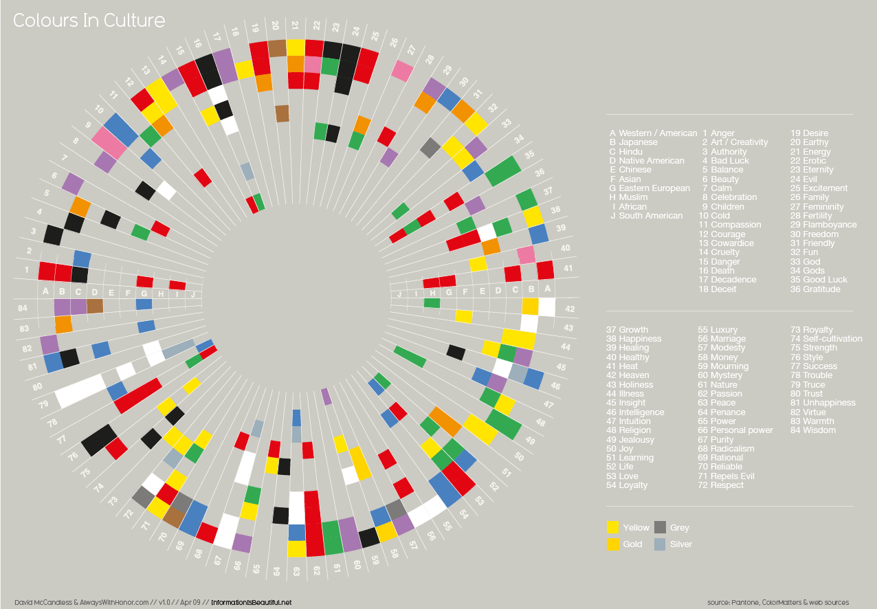
Website with color info graphic – http://www.informationisbeautiful.net/visualizations/colours-in-cultures/
